
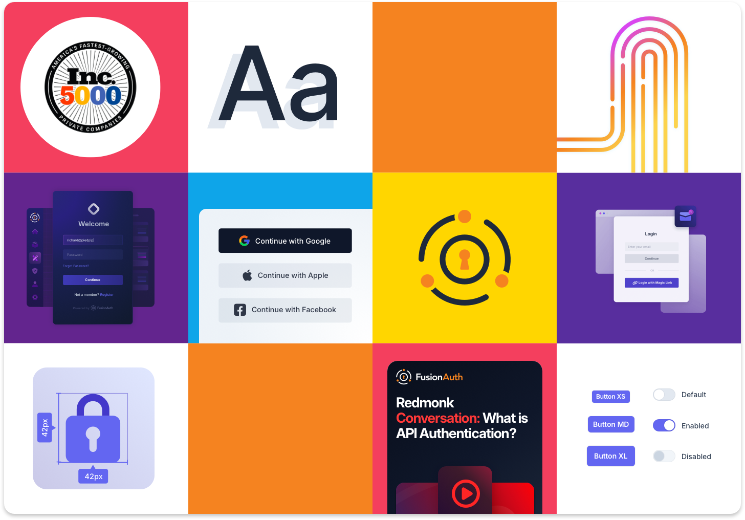
FusionAuth's brochure site, documentation, blog, and admin product had each grown up under different teams, on different timelines, with no shared reference for how the brand should look, sound, or behave. Logos got stretched. Colors drifted. Every new asset was a fresh decision instead of an application of an existing rule. The brief was to take everything scattered across Sketch files, Slack threads, and tribal knowledge and turn it into one documented system that a distributed team, in-house, contract, and engineering, could actually work from.
Before any color or typeface was locked, the system started with six writing principles that would govern every surface: clear, educational, friendly, concise, specific, active. Those rules shaped the visual language as much as the copy: dark theme by default, two-dimensional geometric shapes, generous spacing, and brand color used only as a highlight or a call to action, never as a backdrop. The goal was a system that read as confident and technical without tipping into cold or corporate.
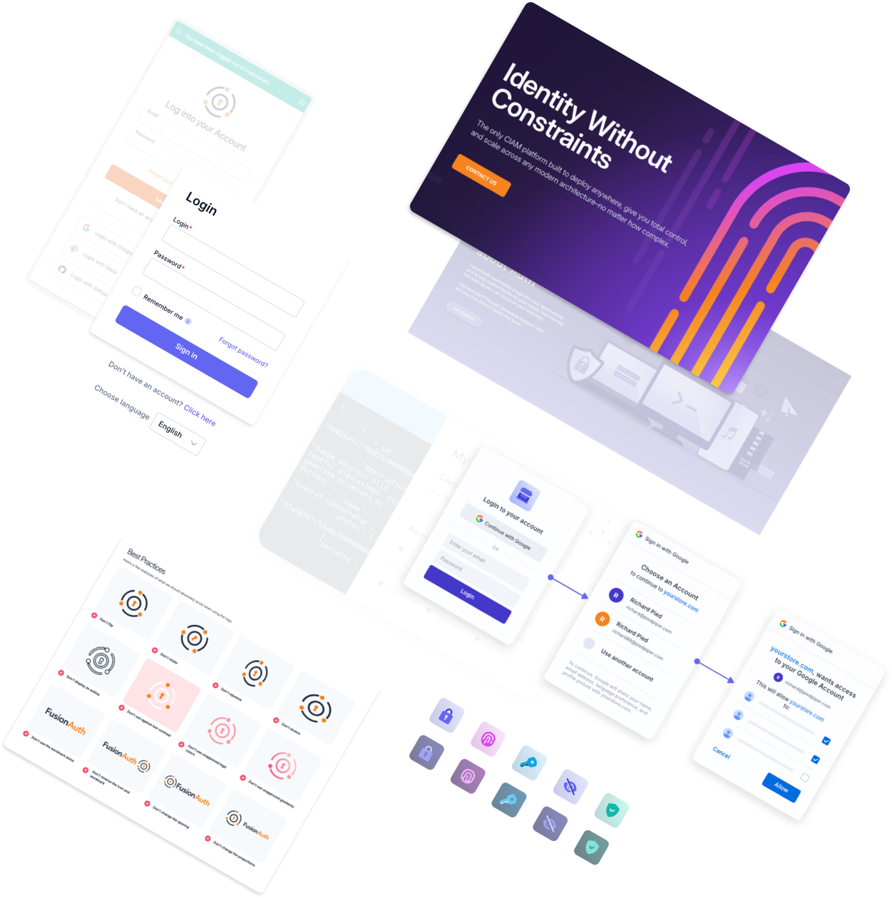
The wordmark is simple, which meant it was also easy to misuse. Clear space was defined as the x-height of the wordmark itself, a minimum size of 48px was set to protect legibility at small scale, and monotone and brandmark-only variants were built for the handful of contexts where the full-color lockup couldn't do the job: single-color print, busy backgrounds, favicons. A running list of common violations (flipped, rotated, squeezed, stretched, recolored) got documented and circulated so reviewers had a shared reference instead of a gut check.
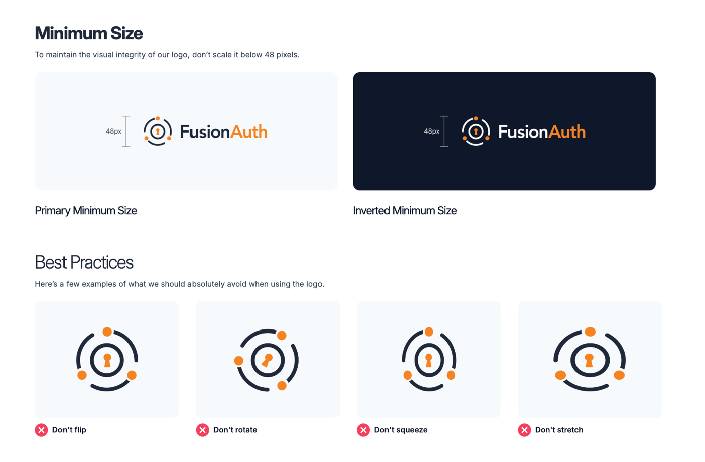
See current FusionAuth Brand & Logo Guidelines here
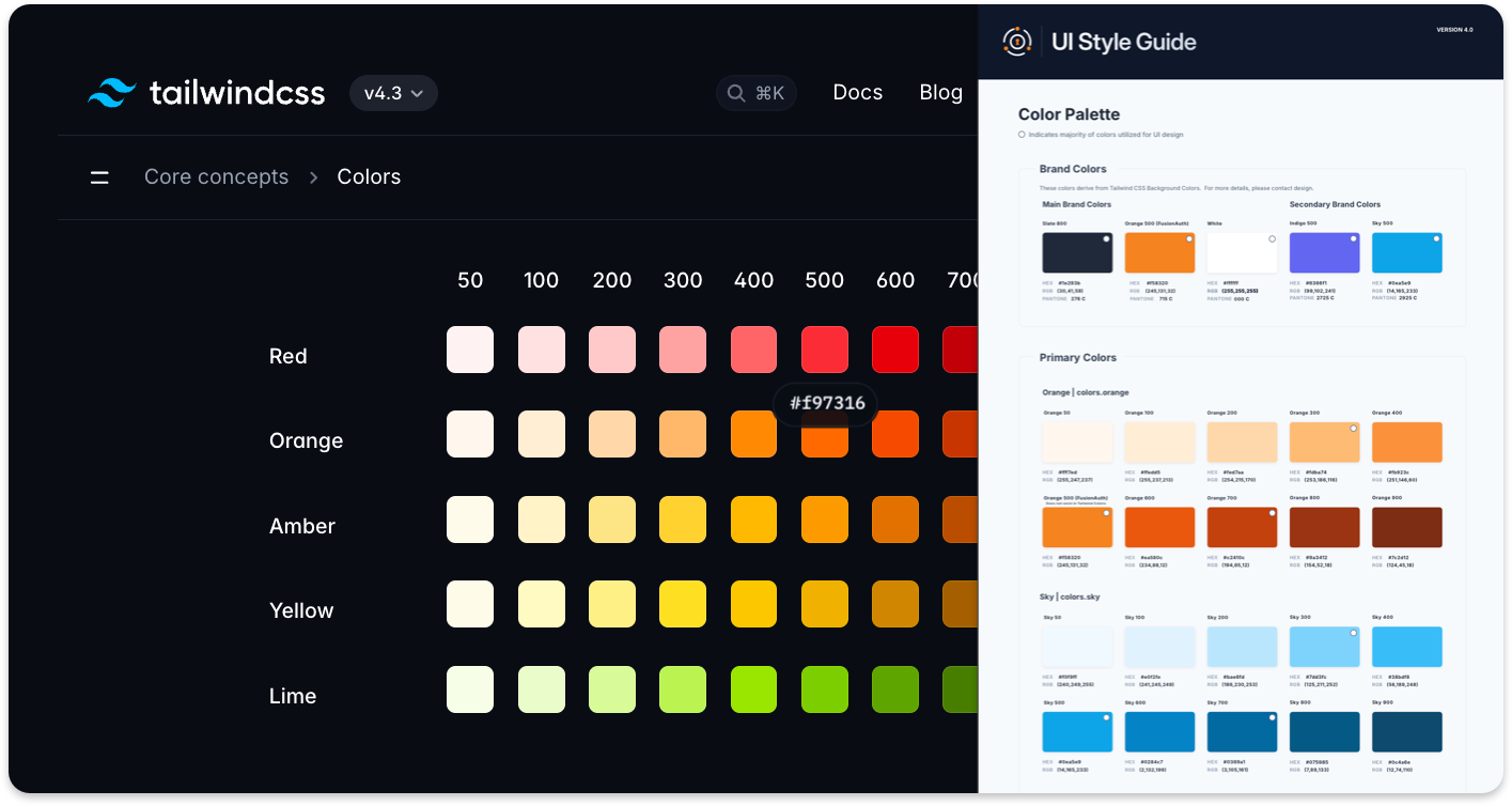
The palette runs on Tailwind's default color scales with one deliberate override: FusionAuth's carrot orange replaces Tailwind's default orange-500 as the signature brand color, paired with a near-black slate, white, and supporting indigo and sky accents. Every hue got a full 50-900 ramp so design and engineering were always pulling from the same source of truth, and each color was assigned a meaning (indigo for calm and users, sky for stability and positive outcomes, fuchsia for confidence and new journeys, rose reserved for danger and alerts), so the same logic applied whether the color showed up in a diagram, an icon, or a product alert. Contrast ratios were checked and documented up front so accessibility wasn't a retrofit.
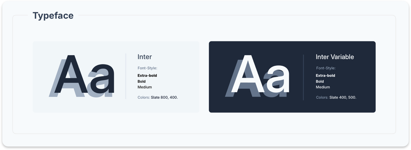
Inter and Inter Variable carry the entire system, from a 72px hero on the brochure site down to a 13px caption in the product. Desktop, mobile, and marketing-display scales were each defined separately, because a headline built for a 1200px landing page and a headline built for a 1200x630 blog cover need different rules to hold up. A hard cap of three font styles and three colors per composition kept marketing assets from sliding into visual noise.
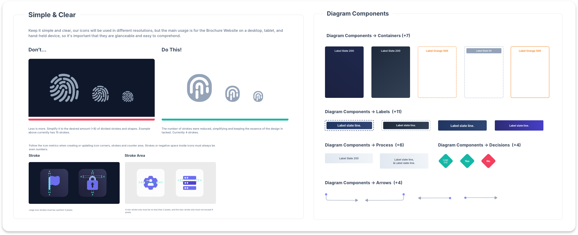
Icons were rebuilt around a pixel-perfect, duotone, geometric standard: even-numbered dimensions only, a fixed 72px/54px/44px sizing scale, and one visual style enforced across the entire library instead of icon sets accumulating from whoever built them last. Diagrams got their own symbol library (containers, process labels, decision nodes, connector arrows) built on the same color and type rules, so a sequence diagram in the docs and a flowchart in a sales deck came from the same visual grammar.
Tech papers, ebooks, and case studies needed to work in both a dark-by-default digital form and a light, print-safe form for enterprise buyers, so both were templated, down to capitalization rules and font hierarchy for cover headers, pull quotes, and highlight boxes. Blog and YouTube covers got their own safe-area and padding specs, a category-symbol system, and a hard rule on color count, so a channel that used to run on one-off exports became a repeatable production process.
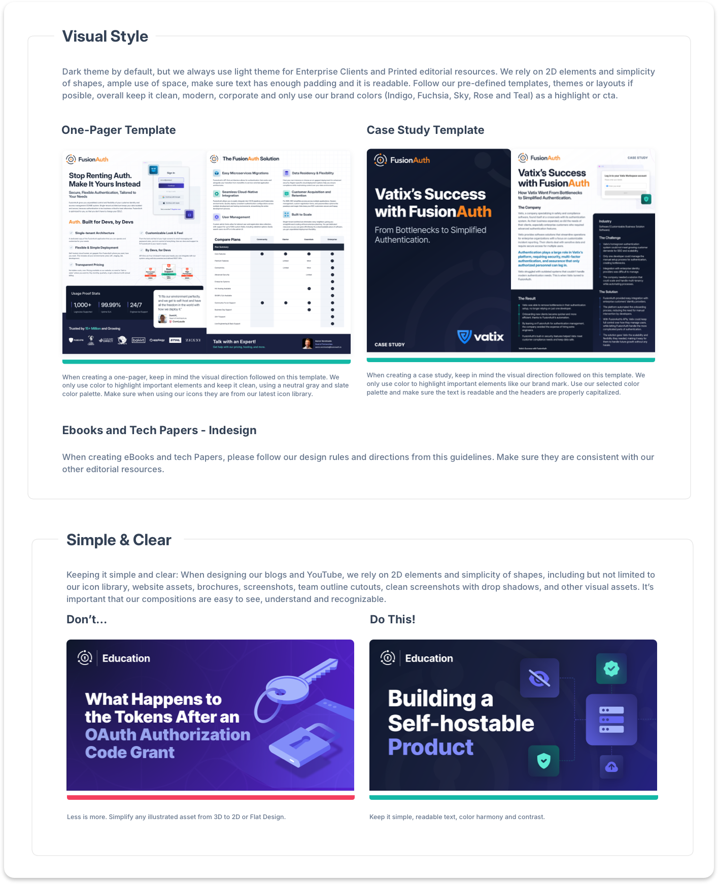
See Editorial Guidelines here
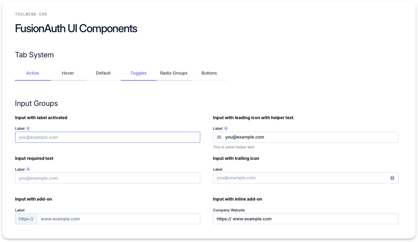
On the product side, a Tailwind-based component library (buttons, inputs, selects, tables, alerts, badges) gave engineering and design a shared vocabulary for the admin application, closing the gap between what the brand looked like in marketing and what it actually felt like to use.
Click here to the full Case Study on UI/UX Product Design
Before a system existed, FusionAuth was showing up to conferences the way a lot of early-stage companies do: generic materials, borrowed assets, no visual coherence from one event to the next. The booth and the brand were not telling the same story.
That changed when the brand did. Booth design, signage, swag, and digital assets were all brought under the same system that governed the marketing site and documentation. Every conference touchpoint, from the physical booth structure to the leave-behind to the screen running behind the team, was designed with the same visual language, the same typography, the same standards.
The event roster was not small. AWS Summit New York and Los Angeles. Google Cloud Next. KubeCon and CloudNativeCon. Identiverse. Identity Week. LeadDev in New York, Berlin, and London. QCon San Francisco. JS Nation. RailsConf. devcom. gamescom. Each one required scoped assets, production-ready files, and delivery on a hard deadline. All of it owned end to end.
The result was a brand that showed up the same way at every event: recognizable, consistent, and built to hold at the scale of a conference floor.
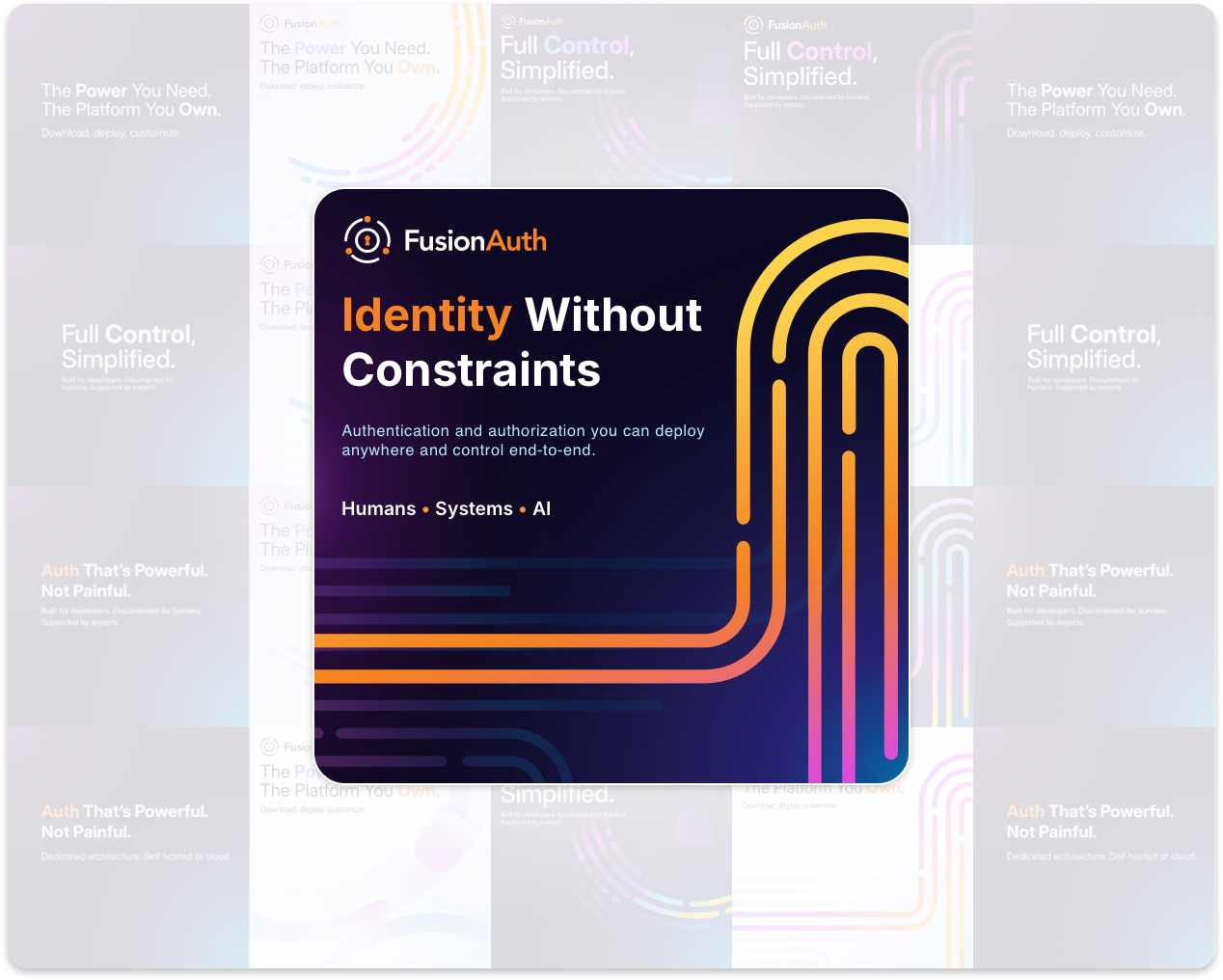
What had been a set of one-off decisions became a documented system spanning brochure site, documentation, blog, and product: logo, color, type, icon, diagram, editorial, and component standards a distributed team could apply consistently without asking design to sign off on every asset.


Beautiful design has the power to captivate audiences.
