
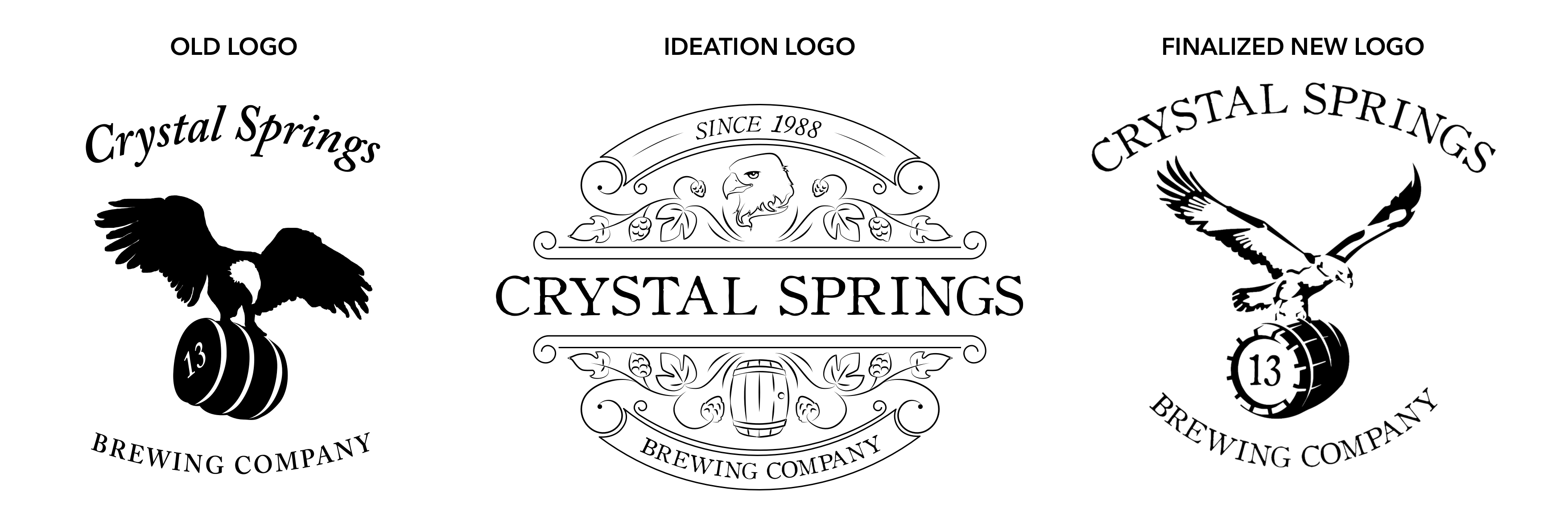
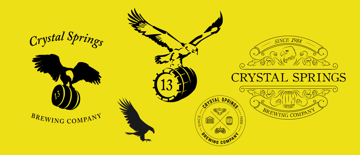
The existing mark had been with the brewery for years but had stopped working. At a glance it read as a vulture, which was not the intention and not the story the brand needed to tell. The first conversation was not about what to design. It was about what to keep. The barrel and the number 13 both carried real weight for the owners, tied to the history and identity of the business from the beginning. Those elements were non-negotiable, and rightfully so. Our job was to build something around them that was legible, ownable, and built for every surface the brand would need to live on. We rebuilt the mark from the ground up with the barrel and 13 as the anchors, expanded the visual language around them, and tested the result at every scale and in every context it would face. What came out was a logo that reads clearly at the size of a can label and holds up at the size of a storefront sign, without losing what made it mean something in the first place.
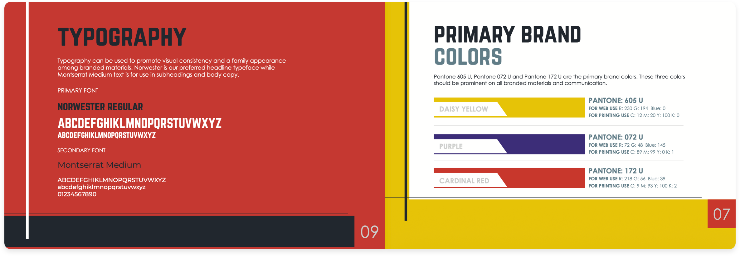
Before we touched a typeface or color palette, we spent time understanding how the brewery talked about itself in person, on social, to regulars, and to first-timers. The identity we built came out of that. Colors were chosen for how they behave on print and screen, not just how they look in a presentation. Type was selected for legibility on a tap list at arm's length in a loud room. Every decision had a reason tied to how the brand actually gets used.
We looked at every physical touchpoint the brewery had: menus, tap lists, coasters, signage. We mapped where the brand was holding and where it was drifting. Most of the drift was happening in print, where there were no templates and every piece was being made from scratch. We built a print system that gave the team guardrails without taking away flexibility. The result was materials that looked like they came from the same place.
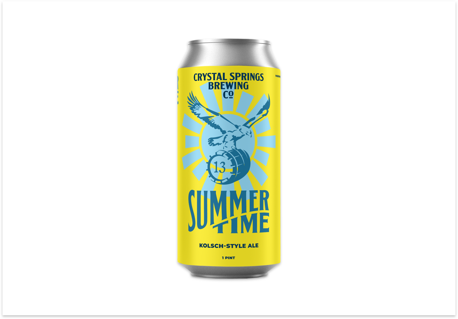
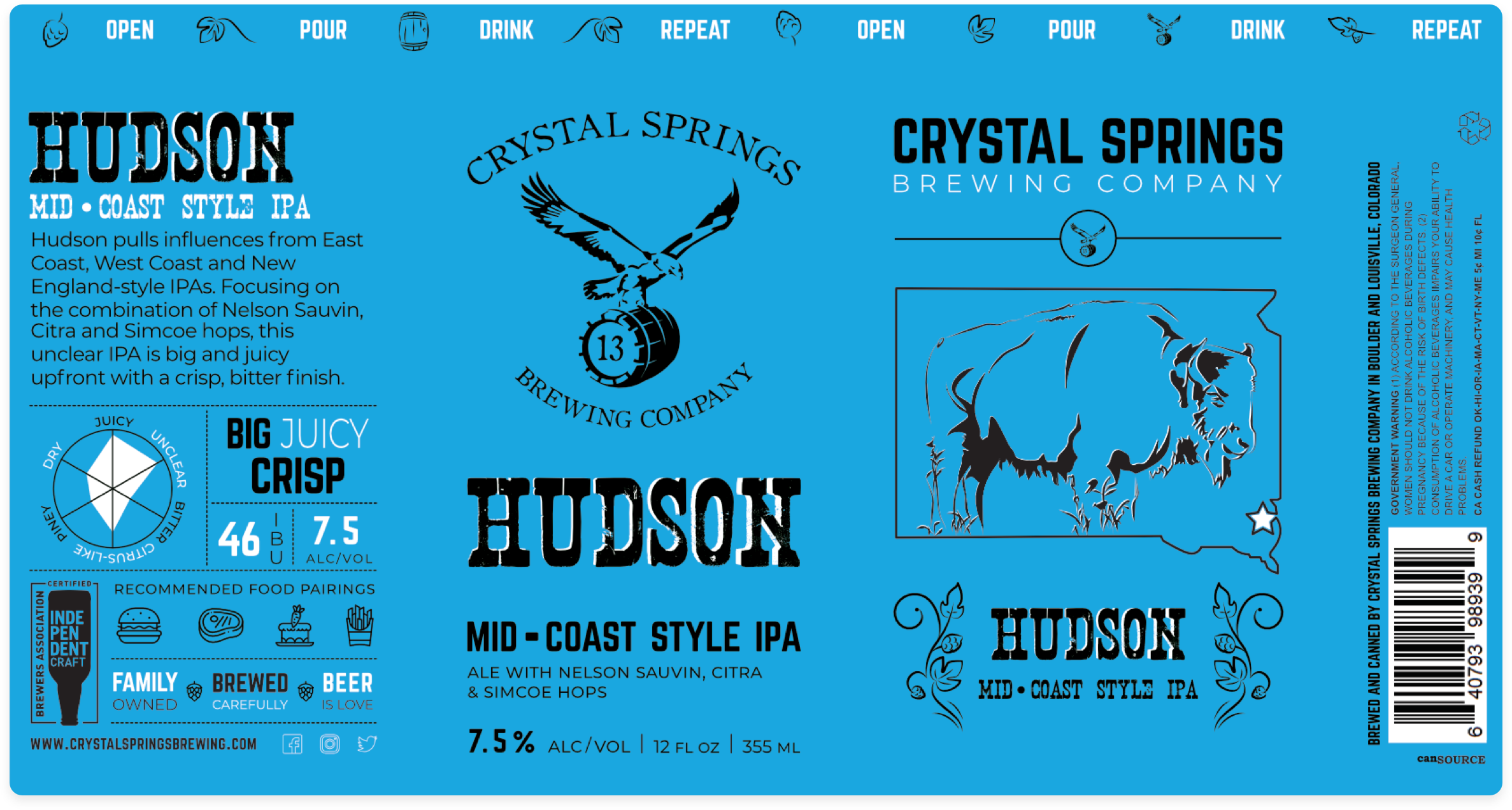
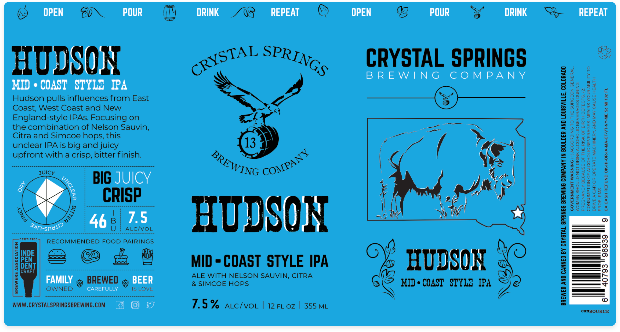
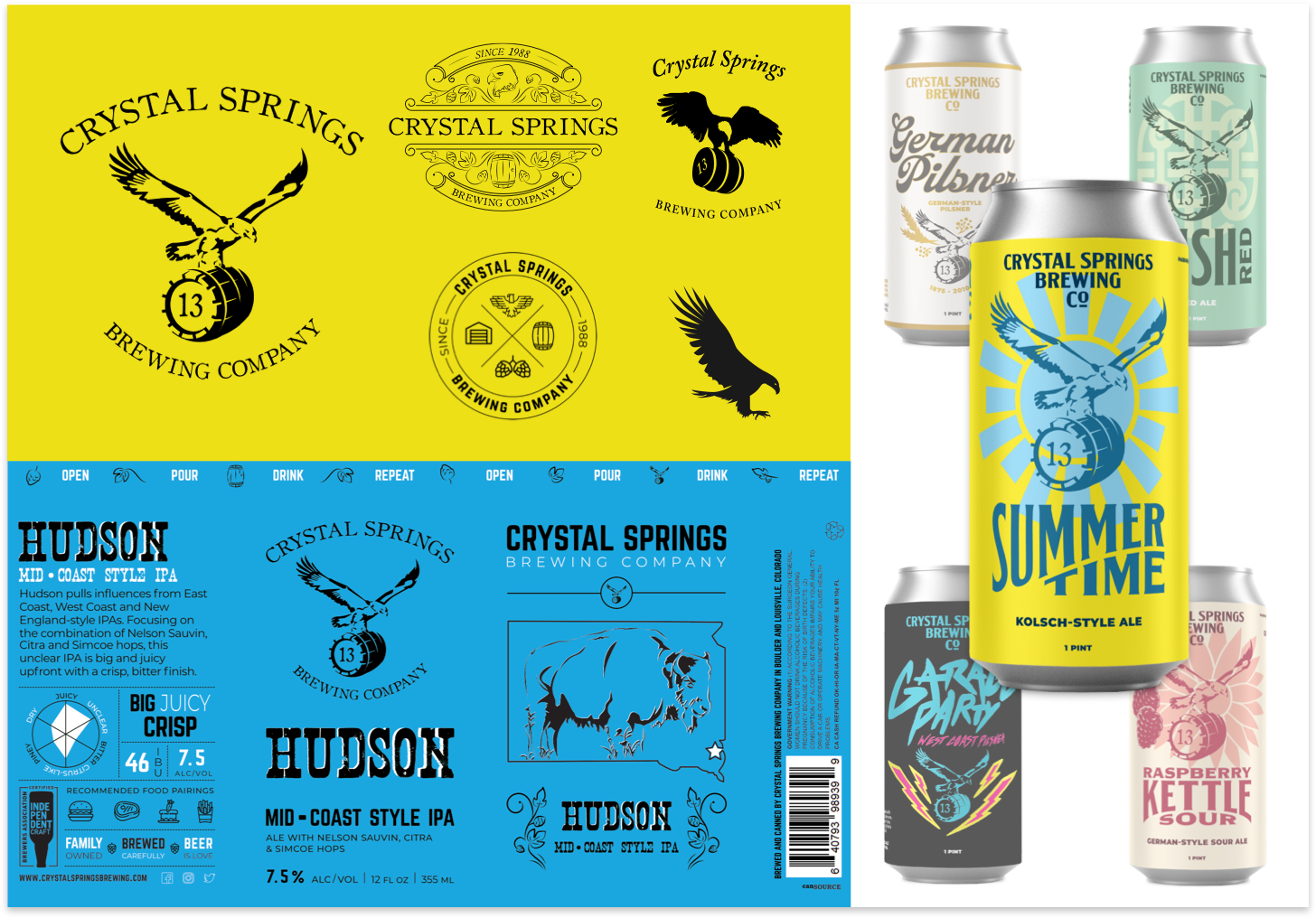
We spent a full session standing in bottle shops, looking at the shelf. Not their shelf, shelves in general. Watching what stopped people, what got picked up, what got put back. That research shaped everything about the can design. We worked through label hierarchy, color behavior across the core lineup, and how the system would extend to seasonal and limited releases before we designed a single label. The final cans were the result of that foundation, not the starting point.
The brief called for something that felt local and specific, not a style pulled from a trend board. We developed the illustration language through reference gathering with the founders: places, textures, and references that actually meant something to the brewery and the neighborhood. The style that came out of that process was something they could point to and say that is us. We then built usage rules so the illustration could scale across cans, posters, and merch without losing what made it feel right in the first place.
Event graphics were the highest-volume output the brewery had to produce: tap takeovers, seasonal releases, live music, festivals. Every event had been treated as a one-off design problem, which meant nothing looked connected. We designed a flexible event graphic system with enough structure to stay on-brand and enough room to reflect the specific mood of each event. The team could produce a poster in an afternoon that still looked like it came from the same brewery as everything else.


Beautiful design has the power to captivate audiences.
